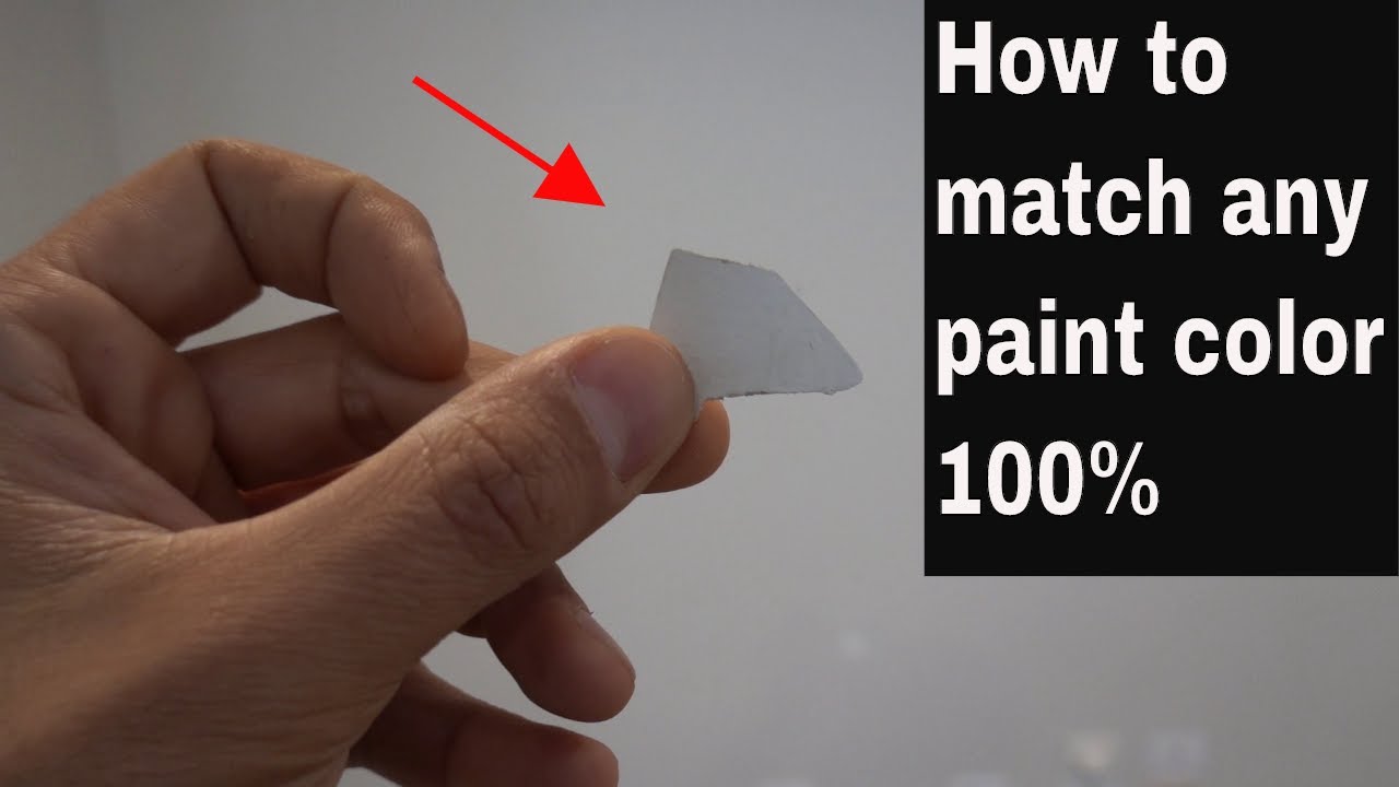
Decoding Paint Color Matching: A Deep Dive into Hues

Ever stared at a paint chip, mesmerized by its potential, only to find it looks completely different on your wall? The struggle is real. Paint color matching isn't just about picking a pretty shade; it's a complex interplay of light, undertones, and the unique quirks of your space. Let's unravel the mysteries and empower you to conquer your next painting project.
Finding the perfect paint color can feel like searching for a unicorn. You envision a serene blue, but end up with something resembling a Smurf's house. Or perhaps you dreamt of a warm beige, only to be greeted by a sickly yellow. The disconnect between expectation and reality often lies in the intricacies of color matching.
Color matching for paint is more than just aesthetics; it's about creating a cohesive and harmonious environment. Whether you're aiming for a bold statement or a subtle shift in mood, the right color can transform a room. But achieving that desired effect requires a deeper understanding of how colors interact with each other and their surroundings.
Historically, paint color matching was a highly subjective process, relying on the trained eye of skilled artisans. The advent of color matching technology has revolutionized the industry, offering greater precision and consistency. However, even with technological advancements, achieving a perfect match can still be challenging.
One of the main issues with color matching is the variability of light. Natural light changes throughout the day, affecting how colors appear. Artificial lighting also plays a significant role, with different types of bulbs casting different hues. This makes it crucial to test paint colors in your specific space under various lighting conditions.
Another factor influencing color perception is the surrounding environment. Existing furniture, flooring, and artwork can all impact how a paint color appears on your walls. Considering these elements is essential for creating a cohesive and harmonious look.
A key aspect of color matching is understanding undertones. Undertones are the subtle hints of color beneath the surface hue. For example, a beige might have a cool gray undertone or a warm yellow undertone. Identifying undertones is crucial for achieving the desired effect and avoiding unexpected color clashes.
One benefit of accurate color matching is achieving a professional and polished look. A consistent color scheme throughout a space creates a sense of harmony and intentionality. Another benefit is the ability to replicate a specific color across multiple surfaces or projects. This is particularly useful for larger projects or when touching up existing paintwork. Finally, precise color matching can enhance the overall aesthetic appeal of a space, creating the desired mood and atmosphere.
To create an action plan for successful color matching, start by gathering inspiration from magazines, websites, or even nature. Once you have a general idea of the colors you like, visit a paint store and collect several paint chips. Test the paint chips in your space under different lighting conditions and observe how they interact with your existing décor. Narrow down your choices to a few favorites and then purchase small samples to test on your walls. Apply the samples to a large enough area to get a true sense of the color and observe how it looks throughout the day.
Advantages and Disadvantages of Color Matching for Paint
| Advantages | Disadvantages |
|---|---|
| Consistent color across different surfaces | Can be time-consuming and require multiple attempts |
| Ability to replicate a specific color | Variations in lighting and surrounding environment can affect the final result |
| Enhanced aesthetic appeal | Cost of paint samples and supplies can add up |
Best practices include testing paint samples on your walls, considering the lighting in your space, understanding undertones, and consulting with a color expert if needed. Real-world examples of color matching success include homeowners achieving a perfect match for their existing trim, designers creating a cohesive color palette for a commercial space, and artists replicating a specific shade for a mural.
Common challenges include difficulty matching colors across different brands, variations in paint sheen affecting color perception, and fading of existing paint making matching difficult. Solutions include using a color matching service, testing paint samples in different sheens, and priming the surface before applying new paint.
FAQs about color matching cover topics such as how to match paint to fabric, how to match paint to a photo, and how to fix a bad paint match.
Tips and tricks for color matching include using natural light whenever possible, considering the undertones of existing décor, and starting with a small sample before committing to a large quantity of paint.
In conclusion, color matching for paint is a crucial element in any decorating or renovation project. Understanding the nuances of color, light, and undertones can empower you to create a space that truly reflects your vision. While challenges may arise, the benefits of a well-executed color scheme are undeniable. By following the tips and best practices outlined in this guide, you can navigate the world of paint color matching with confidence and achieve the perfect hue for your next project. Don't be afraid to experiment, trust your instincts, and embrace the transformative power of color. Remember, the journey of finding the perfect paint color is an adventure in itself, and the reward of a beautifully coordinated space is well worth the effort. So, go forth and conquer the world of color!
Heart hand tattoos for women a symbol of love and style
Unveiling the enigma demetrius big meech flenorys mother
Youre the first my last my everything exploring the power of barry whites lyrics


